Examples derived from the NSW Design System guidance
on charts and graphs. This page is intended to demonstrate how the
charts from the guidance page look with minimal changes beyond setting
the theme. There are some inevitable differences due to different
defaults in chart behaviours between ggplot and other frameworks.
Comparison and ranking
Bar (vertical)
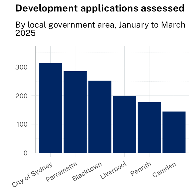
Summary: City of Sydney and Parramatta assessed the
highest number of applications in Q1 2025, together accounting for over
a third of the total.
Source: NSW Planning Portal. Last updated: March
2025.
Stacked bar
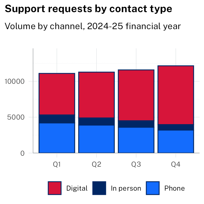
Summary: Digital contact grew steadily across all
four quarters, while phone and in-person volumes declined. By Q4,
digital accounted for more than two-thirds of all requests.
Source: Service NSW. Last updated: June 2025.
Trends over time
Line
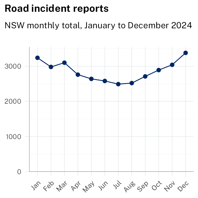
Summary: Incidents were highest in summer months,
peaking in December and January. July recorded the lowest monthly total
for the year.
Source: Transport for NSW. Last updated: December
2024.
Multi-line
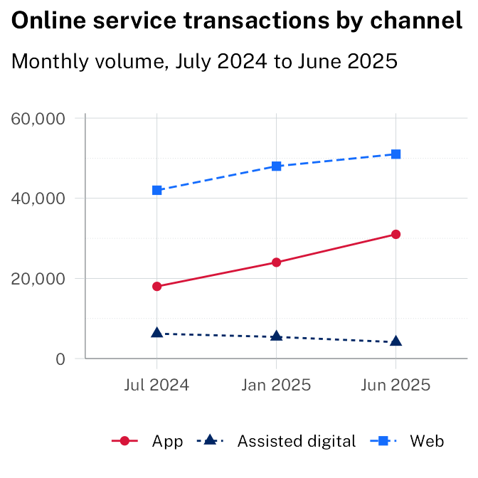
Summary: App transactions grew fastest over the
year, nearly doubling. Web remained the largest channel. Assisted
digital declined steadily as self-service adoption increased.
Source: Service NSW. Last updated: June 2025.
Area
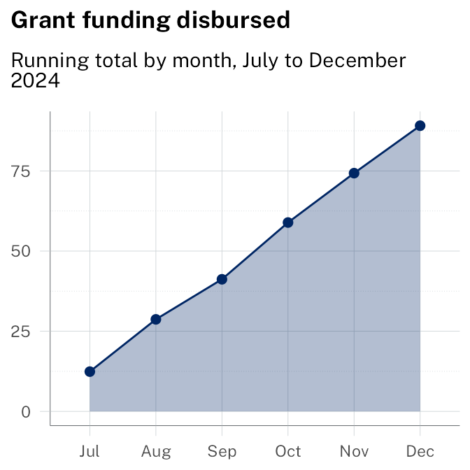
Summary: Grant disbursements accelerated from
October, with the final quarter accounting for more than half of the
full-year total.
Source: NSW Treasury. Last updated: December
2024.
Stacked area
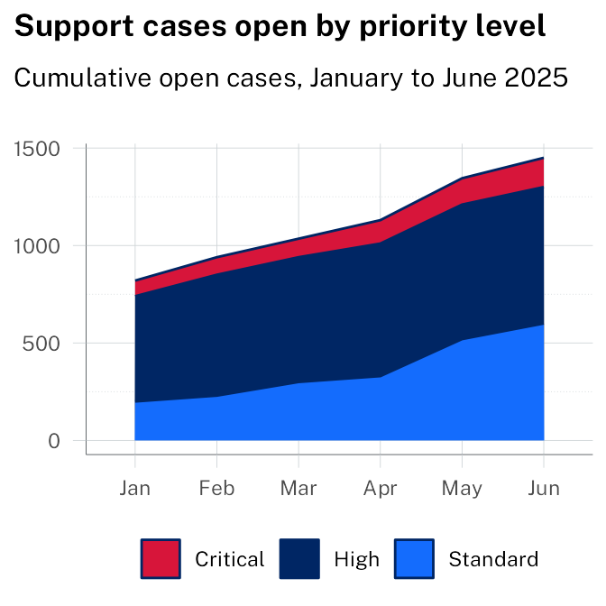
Summary: The total number of open cases grew
steadily across all priority levels. Critical cases grew fastest
proportionally, nearly doubling between January and June.
Source: Service NSW. Last updated: June 2025.
Distribution and correlation
Scatter plot
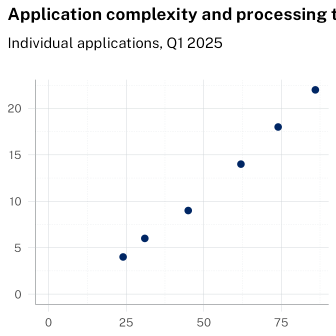
Summary: Applications with higher complexity scores
consistently took longer to process. Most straightforward applications
(score below 30) resolved within 5 working days. Complex applications
(score above 70) averaged 18 days, with significant variation.
Source: NSW Planning Portal. Last updated: March
2025.