When to use
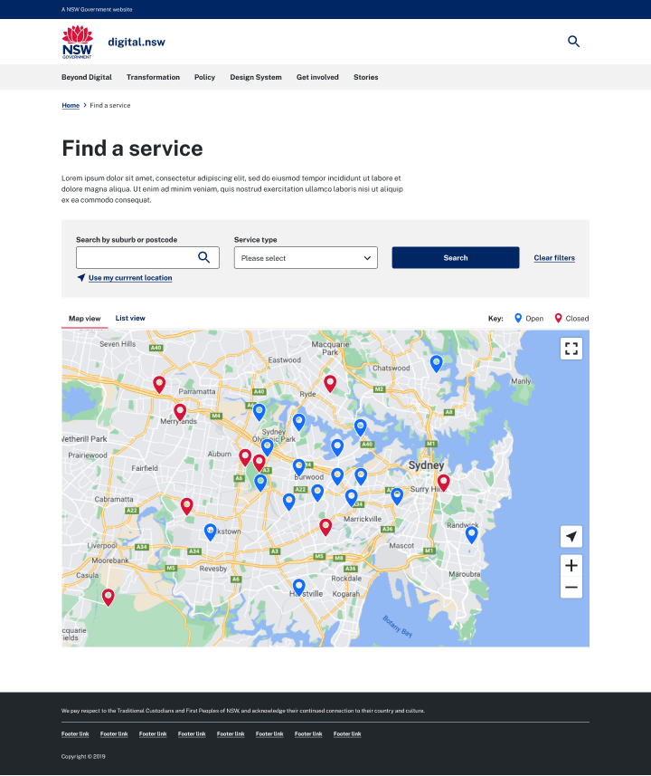
Use a map when your users need to see the location of things relative to each other - for example locations where they can access a service.
Test your solution
Maps can be a challenge for users on small screens, so it is important to carefully consider if it brings value to your product or service. Ensure on mobile, users can still scroll the page by keeping the map’s aspect ratio different to the user’s screen.
Provide a text-based alternative
Do not rely on users being able to use a map. Make the content available without using the map by offering a text-based alternative.
How it works
Navigating the map interface
Allow spacing around the map area on mobile devices to ensure users can scroll past map and give an option to close or minimise the map option where appropriate.
To ensure users have a consistent and smooth experience with the map interface:
- update data points as the user pans based on centre of map
- use an appropriate zoom level by default
- consider each zoom level carefully and what information should be visualised
- use clear and legible labels
Data points
Markers are used to indicate relevant data points for the user to focus and interact. When a user selects a data point, it should centre on the map and it’s listing should move to the top of the results. On selection, a pop up can also be triggered to provide a snapshot of the data point and link to further information (if requried). Pop ups should be dismissable by the close icon and also close when an alternate data point is selected.
When implementing data points:
- ensure touch target size is minimum 44px x 44px (this can include white space around the target) to ensure ease of selection on touch screen devices and comply with WCAG 2.2 accessibility requirements
- if multiple data points overlap in a view, consider using the clustering symbol
Filtering
Filters allow a user to narrow down the visible data points by their requirements - for example the location or available facilities. Fields labels should be descriptive and clearly identify the input required of the user (ie. postcode, suburb or full address).
Displaying results
When a user selects a result from the listing, it should move to the top of the results and centre the data point on the map with an active pop up (if applicable). Use title of the result to link user to further information.
When displaying results, consider what information is important to the user and what they require to make an informed decision.
When displaying results:
- make phone numbers clickable on mobile
- update results as user pans based on centre of map
Data & information styling
Maps in NSW Government should have a consistent look and feel. Configure your map to use the following styles.
Designing
Use pins, cirlces or lines to represent data points. Markers are implemented using a hosted marker generator. We’ve created a sample set in Figma that can used to show example styling to developers.
Colour: The reccomended colour set is Blue 02, Red 02 and Grey 02. When using pins and circles you can also use an outline to ensure contrast with the map interface. If additional colours are required from the NSW Governement colour palette, be mindful of users with colour blindness and test to ensure sufficient contrast.
Icons: Icons can be used to highlight specific offerings of a data point. Use familiar and easily recognisable icons.
Pop ups: Where possible, align your pop ups to NSW Governement visual langauge. This can be done by:
- 4px border radius to indicate an interactive element
- drop shadow for layering
- close button in top right corner
Code implementation
We recommend using a well supported maps platform, such as mapbox or leaflet.js.
When adding markers, use a generator to make sure you have the flexibility needed. We've used Mapbox in our demo which contains an icon generator. If you're using leaflet, MapMarker.io is a publicly available (CC licence) resource to generate markers on-the fly, or the SVGs below can be modified in figma.
Use hex colours from the NSW Brand Palette, and work with designers if you've not been given specific colours, as your branding colours may be different to NSW corporate branding.
Marker examples